
2026
Rebuilding a dying platform
Jyllandsposten's biggest source of lost subscribers wasn't a competitor. It was death, from old age.
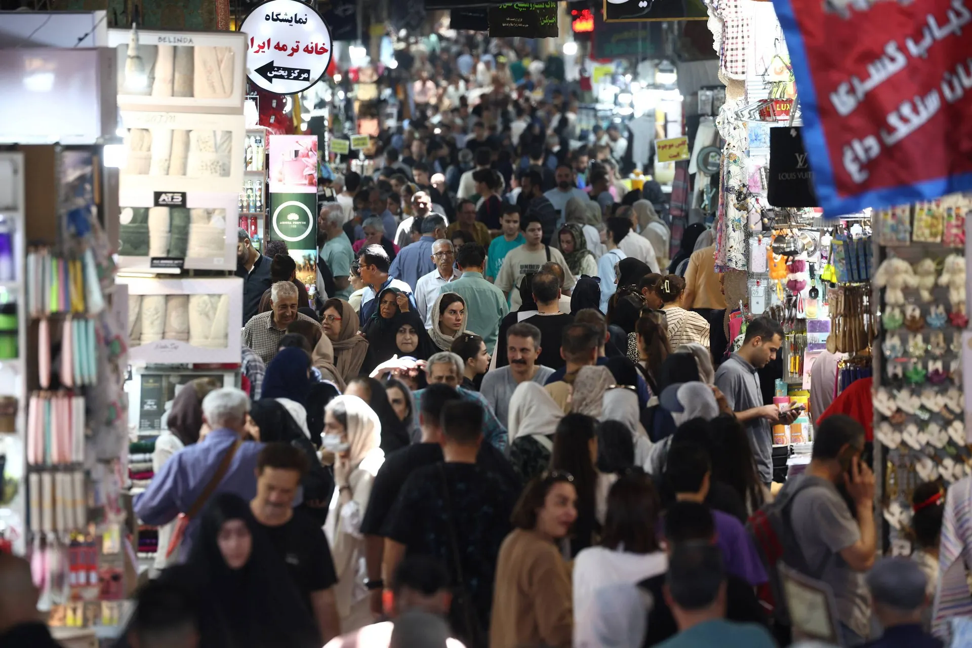

Context
I currently work as a product designer at JP/Politiken, across all of their 75+ medias like Politiken, Jyllandsposten and Ekstra Bladet. This case covers the rebrand and platform redesign for Jyllandsposten, run with one other product designer. I led design of the new platform end to end: specced the entire platform, then worked it through build with a product team of PMs and developers.
Jyllandsposten had no future with the audience it had
Younger readers were going elsewhere, to competitors with sharper brands and better products. Jyllandspostens readers are loyal, but with no new readers attracted to the news platform, Jyllandspostens biggest cause of churn was readers dying of old age. The new target group was aimed to be wealthy, liberal, and politically interested individuals in the age group of 30 to 50 years old.
A process built for a company where everyone needs a say
Jyllandsposten runs on consensus. Every decision gets wide input before it moves, which is reasonable in principle and slow in practice. I set up an iterative process with clear documentation and regular check-ins, so work kept shipping without every step needing a room full of stakeholders. That process is what let two designers cover a full rebrand and platform redesign on a realistic timeline.
Extending the brand past the logo, into the product itself
Logo, color, and type were decided by an external consultant, marketing, and the chief editor. My work picked up where those decisions ended: turning a brand identity into a product people actually read. Before I designed a single real page, I mocked up what the new brand could look like applied to a website, in Figma so I wasn't redesigning finished pages later because the brand didn't translate to screen the way everyone assumed.
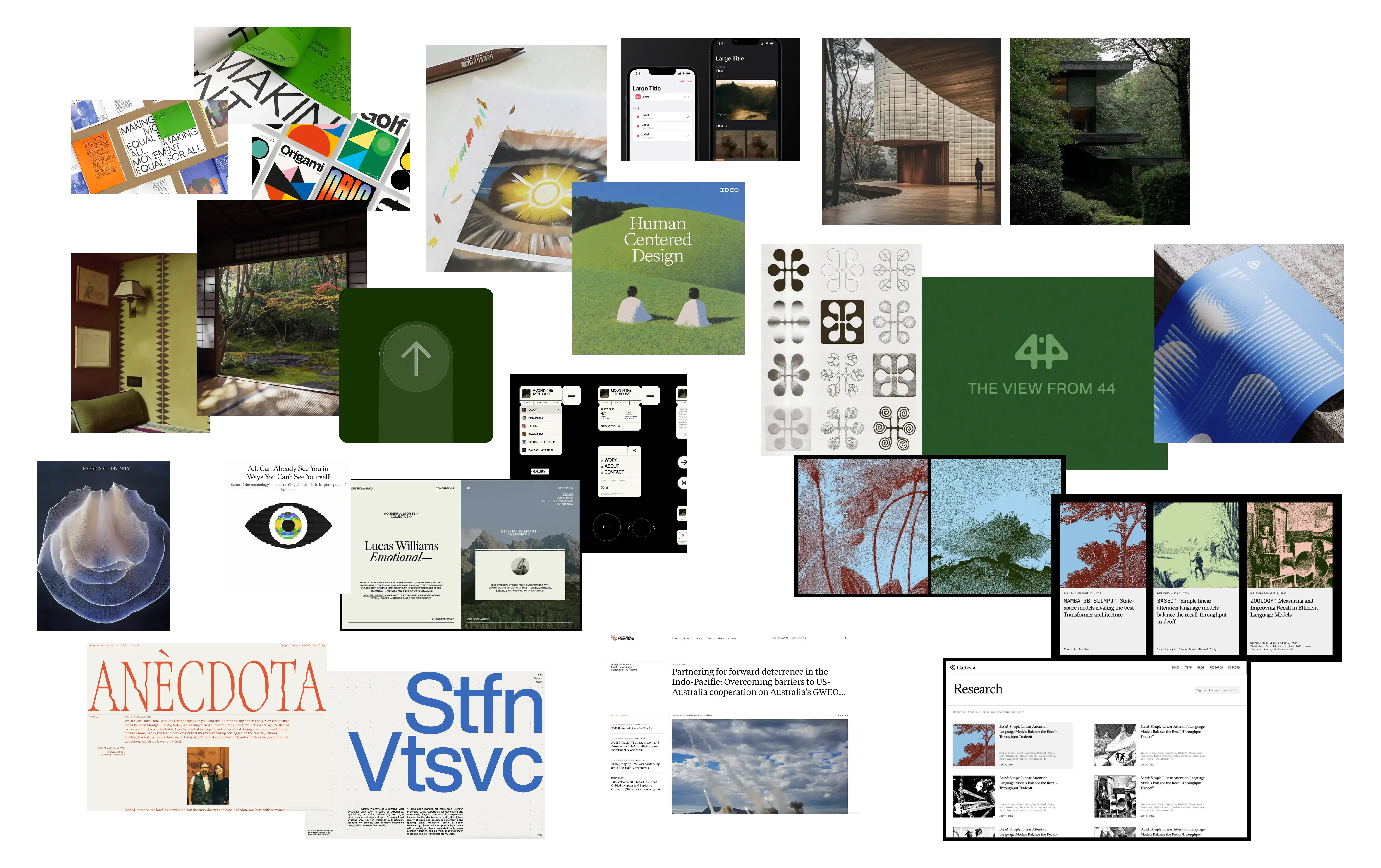
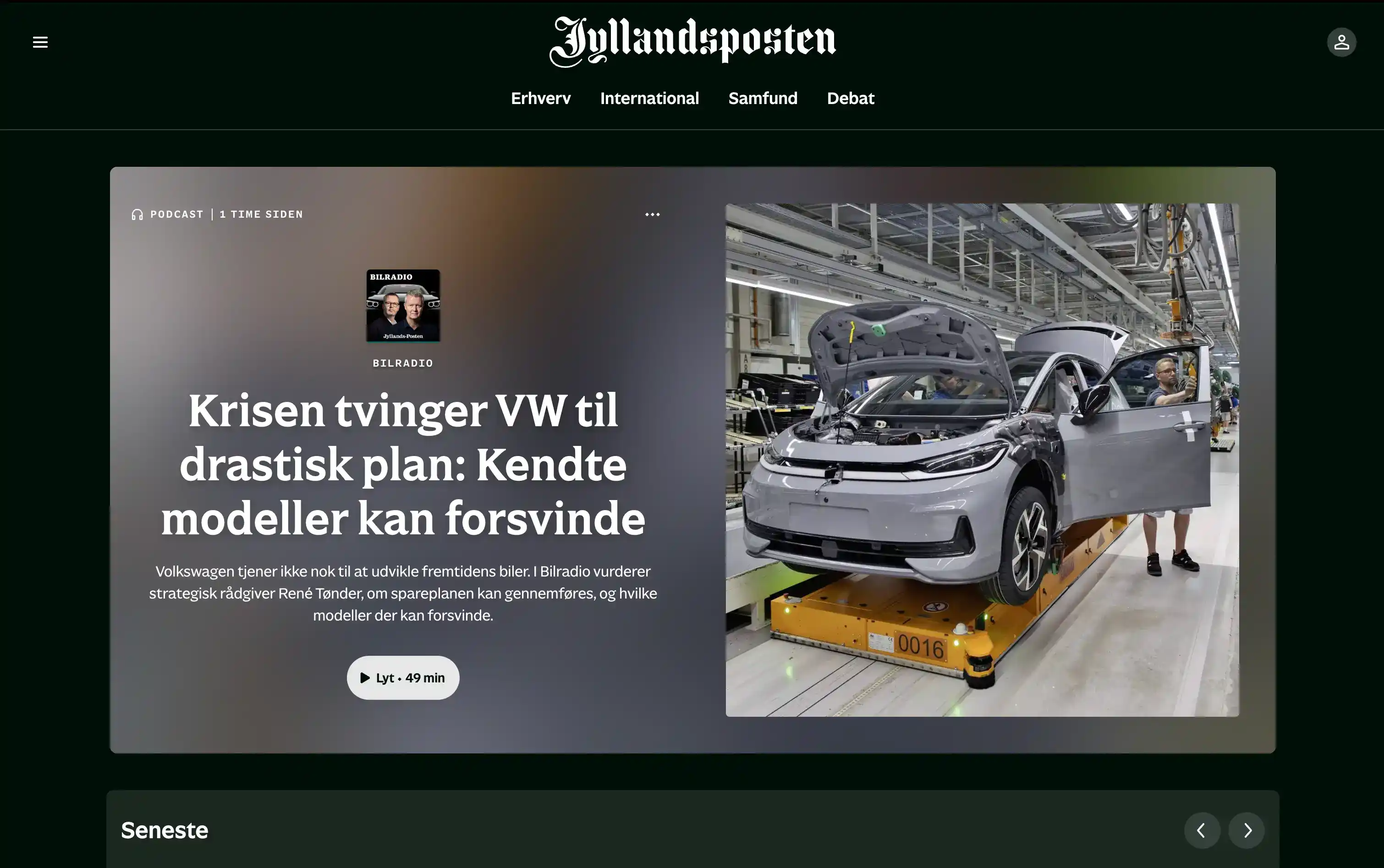
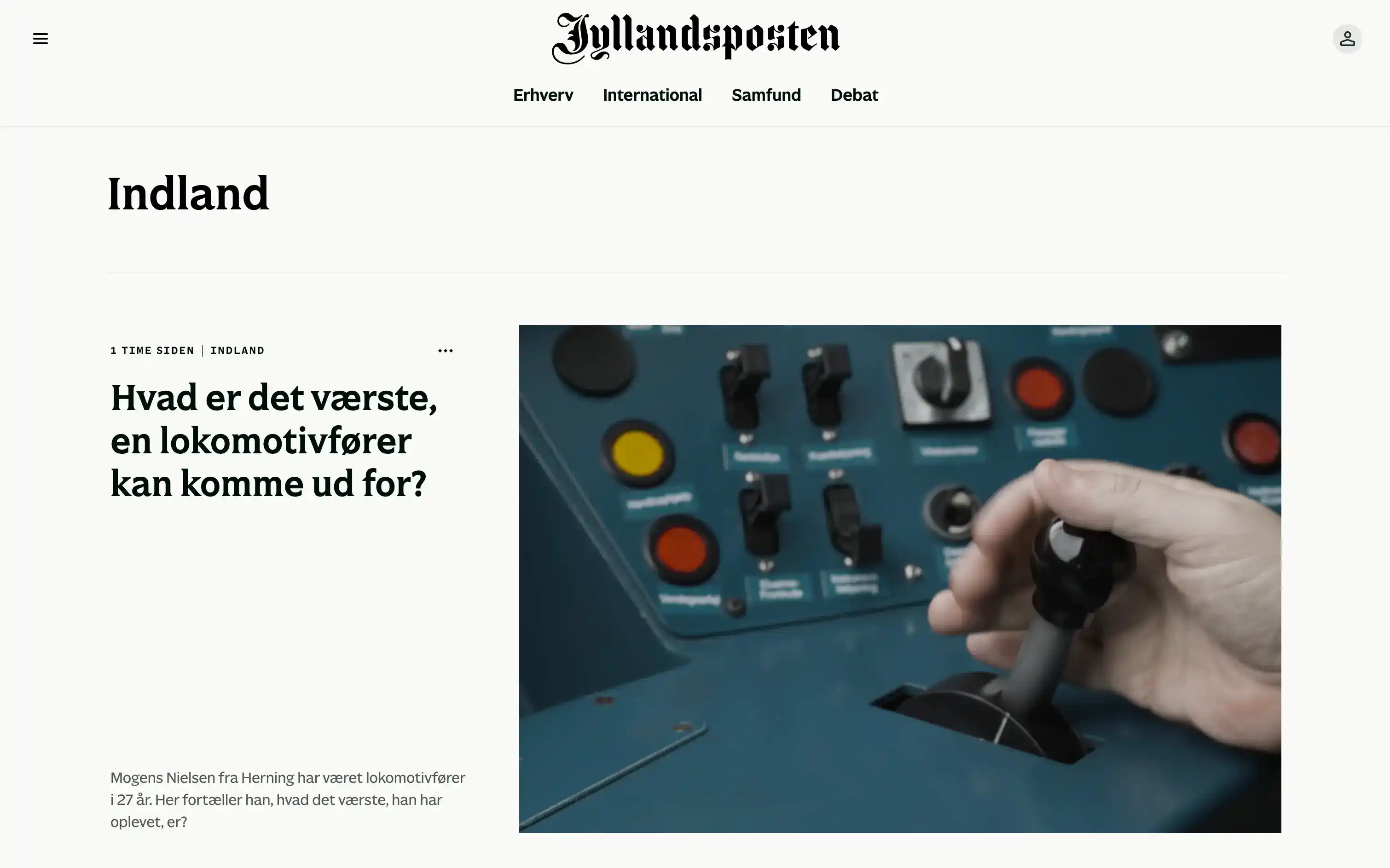
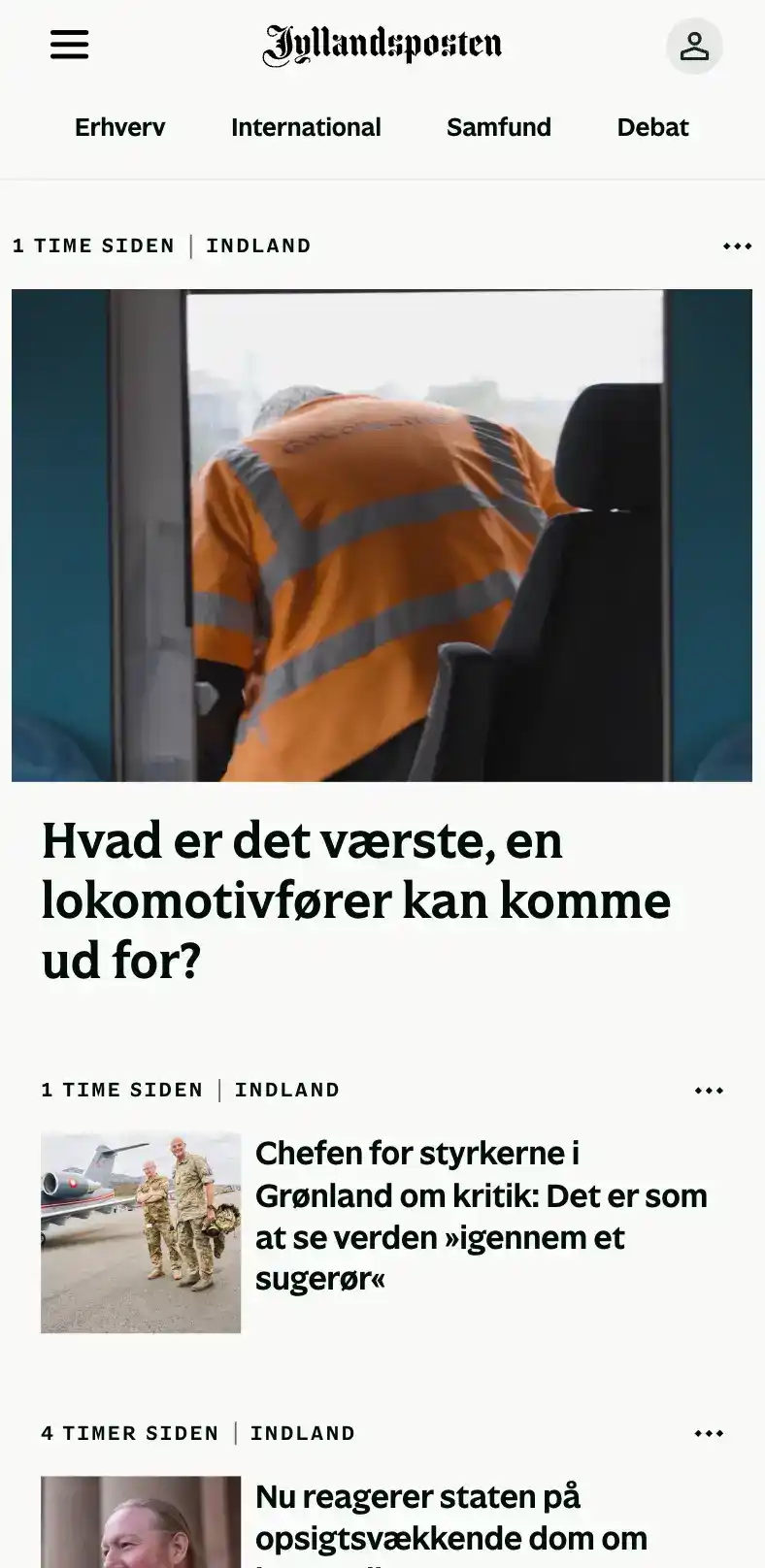
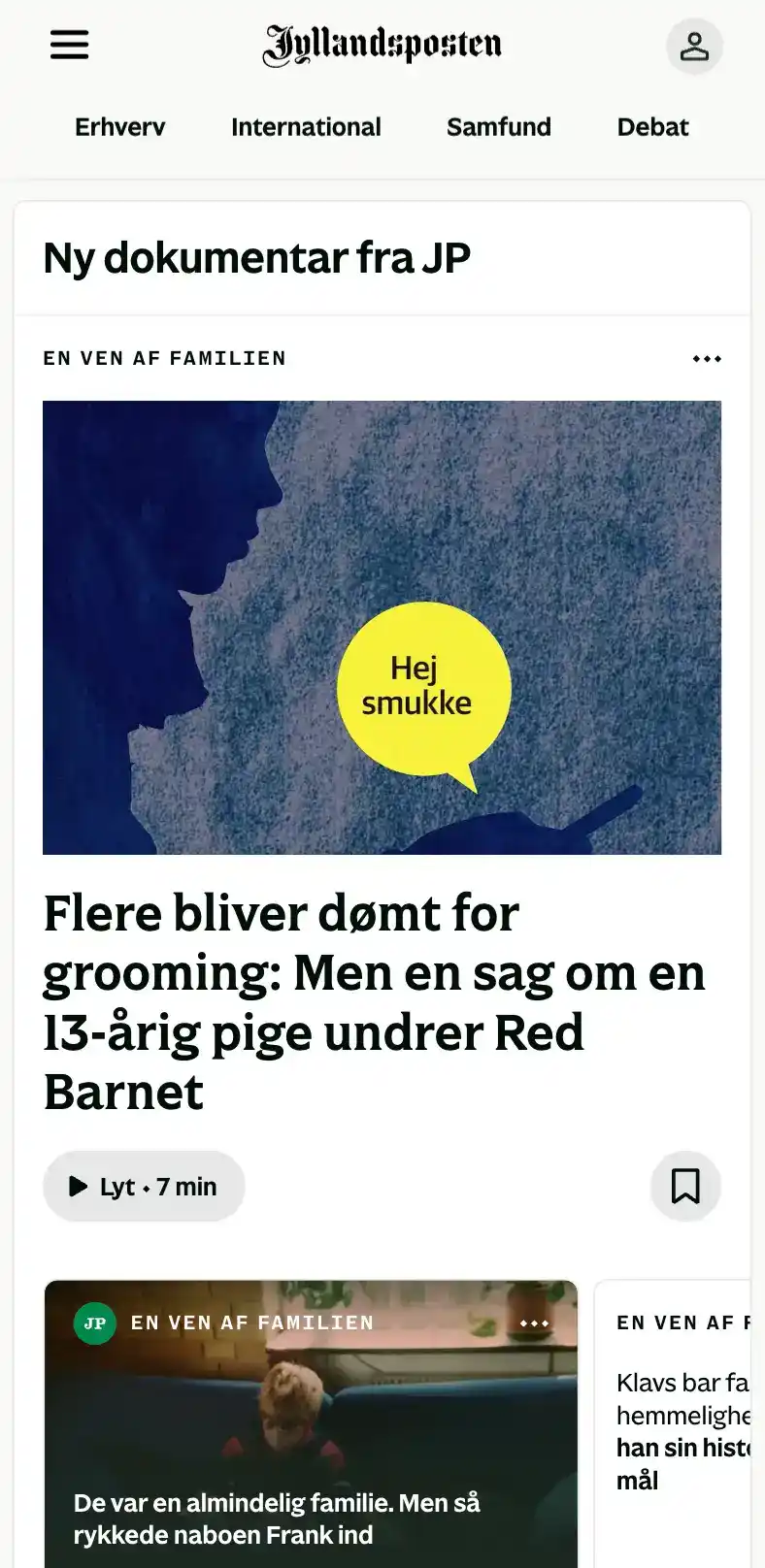
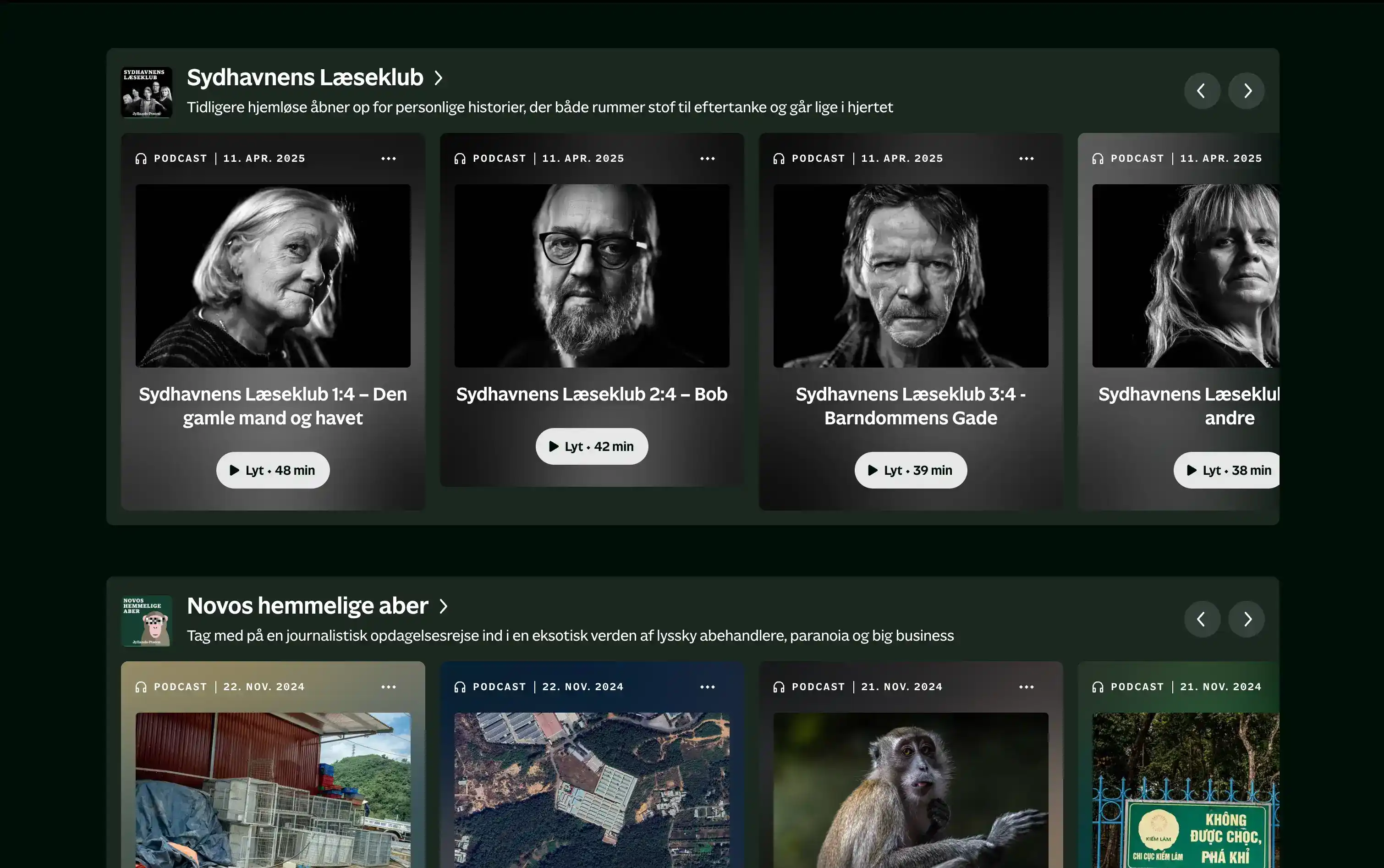
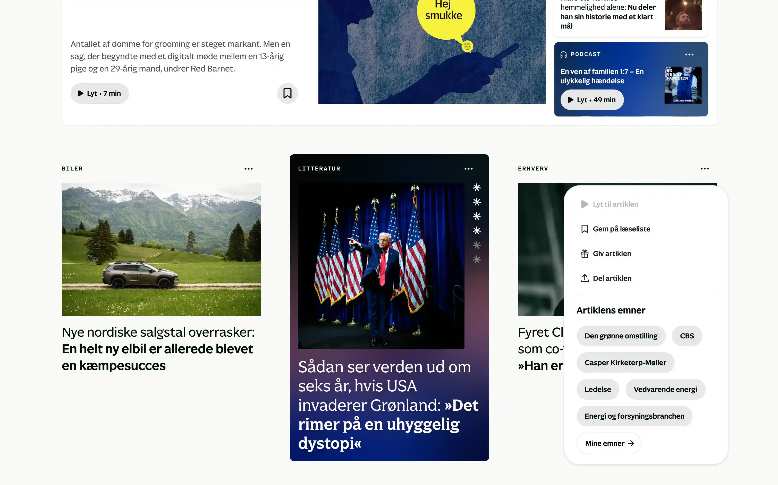
I pushed the brand into article layouts, front-page teasers, and the podcast universe, so a podcast teaser and a debate teaser looked distinct and easy to understand at a glance.

Designing for how the new audience actually reads
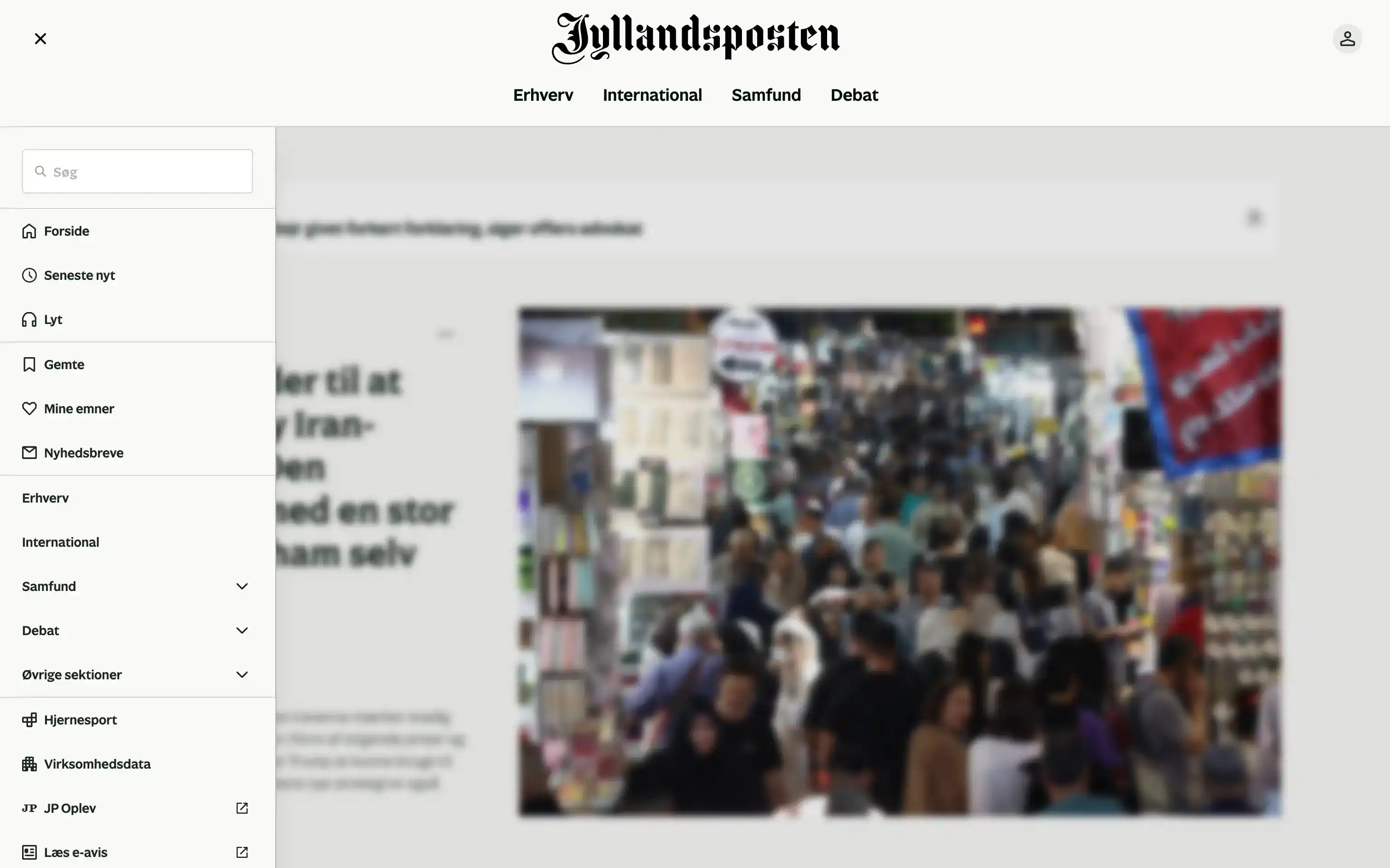
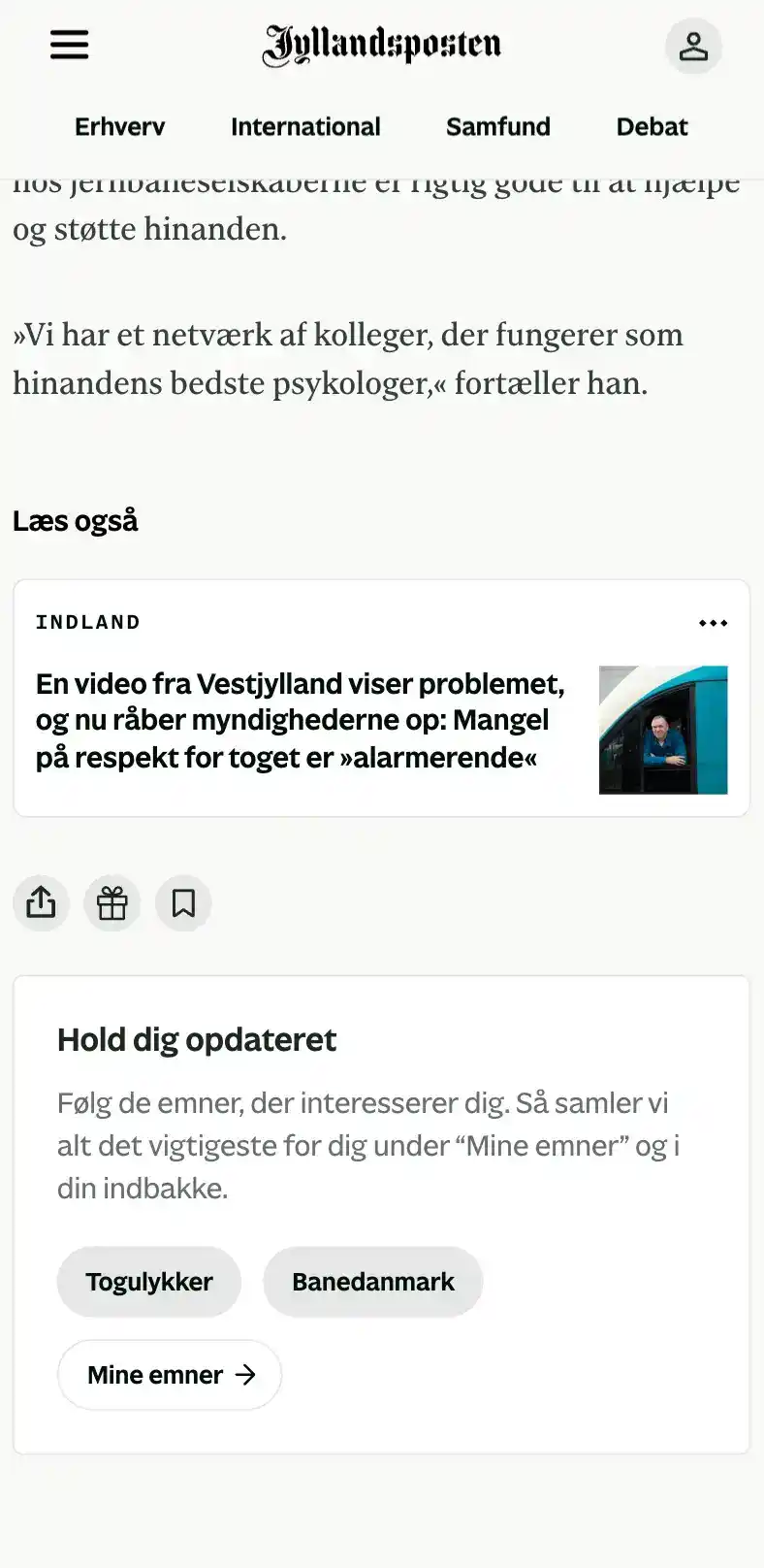
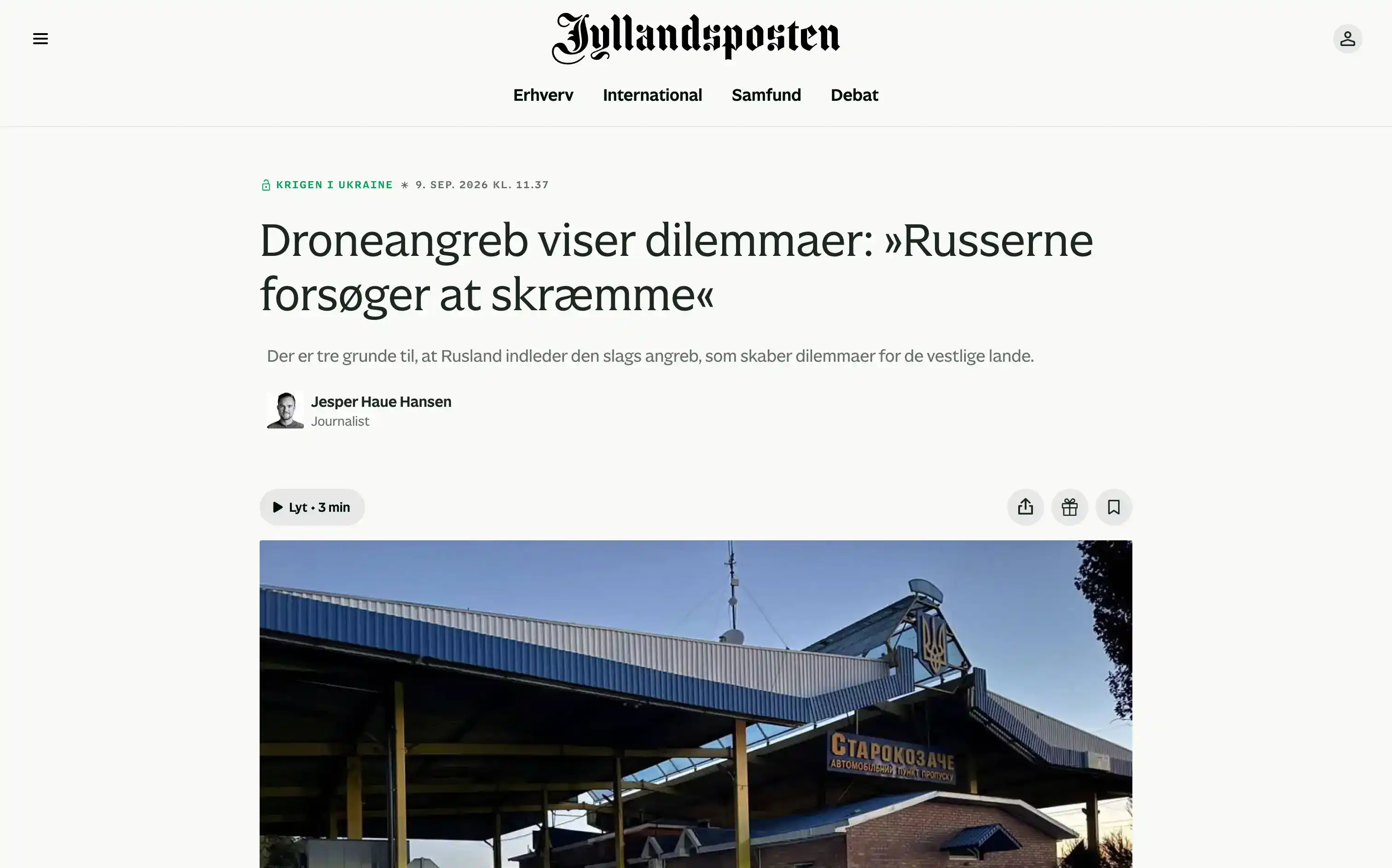
The target reader has ten minutes on a train, not an afternoon with a paper. I built a stronger typographic hierarchy so a busy front page could be scanned, not just read.
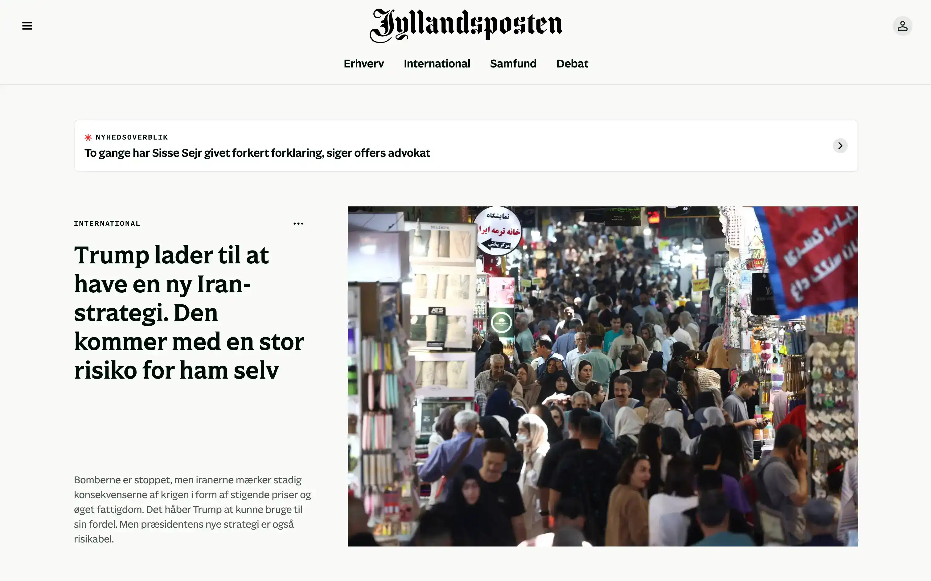
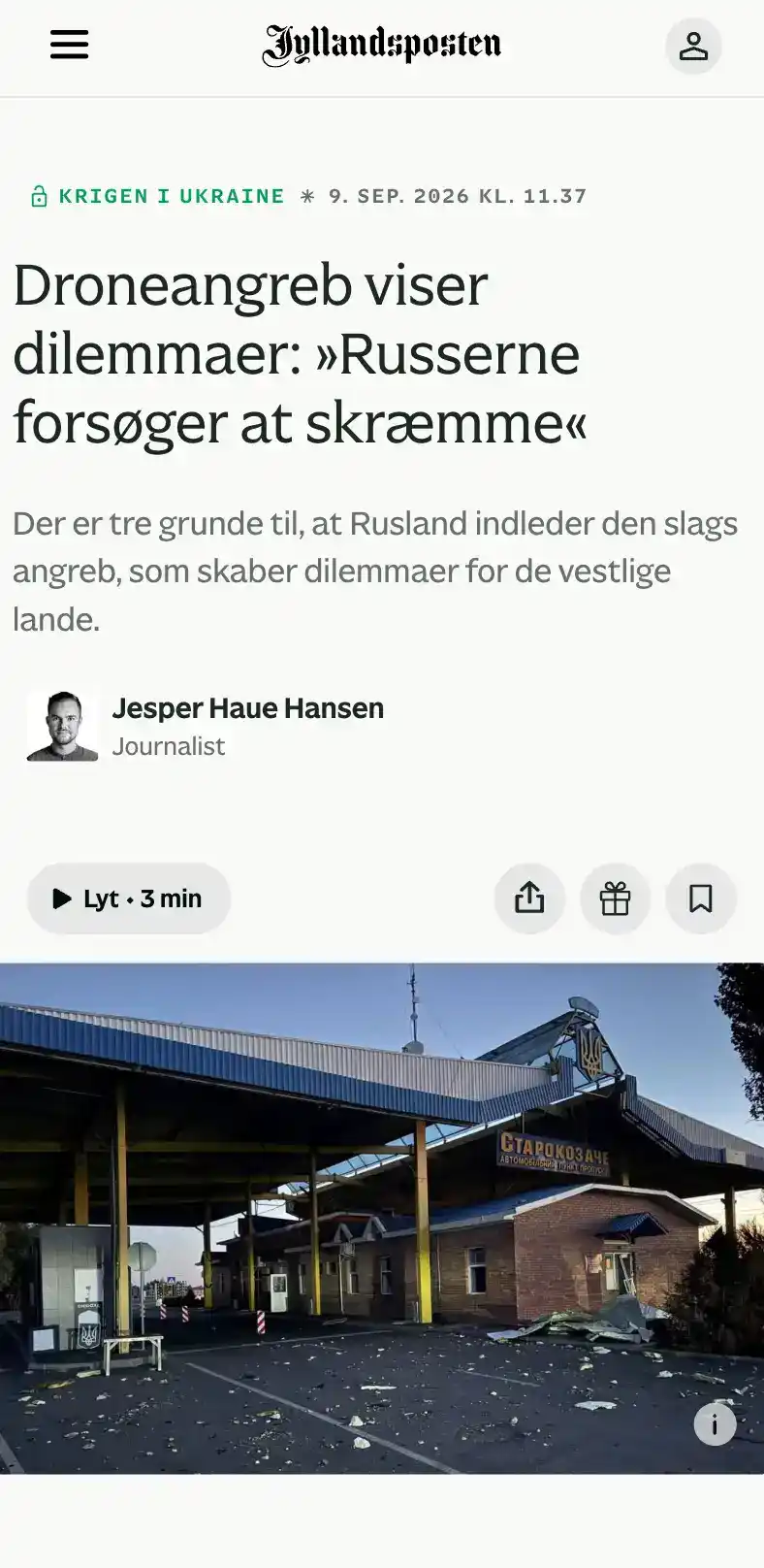
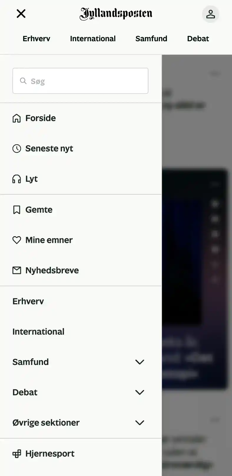
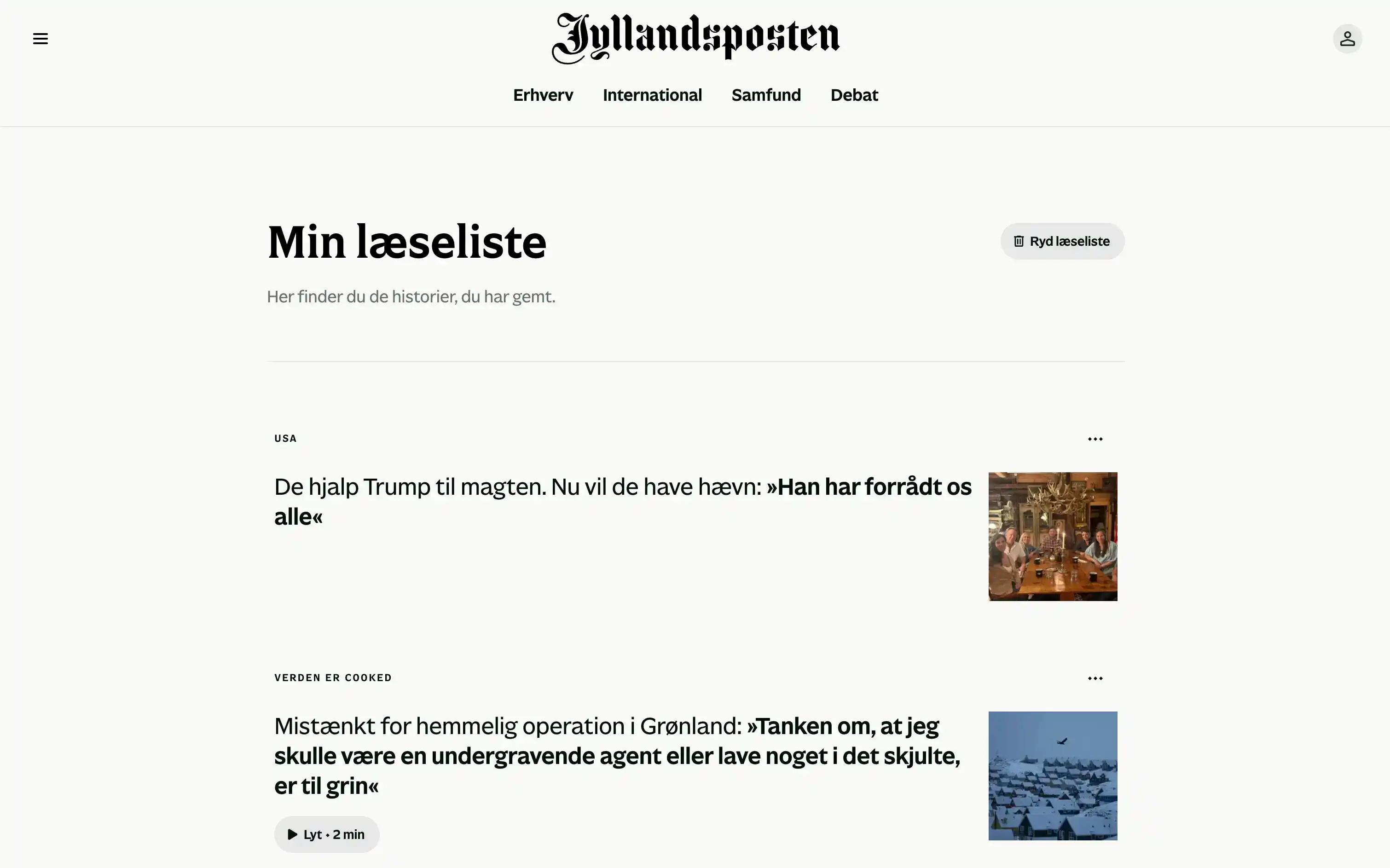
I also added a way to listen to articles instead of reading them: the single most requested feature from the new audience.
The platform isn't live yet, but the people who have to sell it are already sold
Development is still underway, so there are no numbers yet. What exists instead is that editorial staff, who write for this platform daily, told me they're finally proud of the Jyllandsposten brand and can't wait to see their work live on it. Leadership signed off on the full project, saying they hadn't expected it to look this good. Test audiences responded well too.








" height="58px" id="wdCzpTzdC" width="6.814159292035413px"/><path d="M 53.378 6.329 L 53.378 0 L 0 0 L 0 6.329 Z" fill="rgb(255, 255, 255)" height="6.329159212880143px" id="AseBph6a8" transform="translate(4.956 36.937)" width="53.377581120943944px"/><path d="M 0 2.292 L 6.192 0 L 27.258 56.089 L 20.082 56.089 Z" fill="rgb(255, 255, 255)" height="56.089320214669044px" id="mu_anQsXZ" transform="translate(8.001 1.911)" width="27.25754572271387px"/><path d="M 0 0 L 6.659 0 L 7.382 1.919 L 1.239 4.254 L 0 4.254 Z" fill="rgb(255, 255, 255)" height="4.254025044722724px" id="OkG9VzTpO" transform="translate(6.814 0)" width="7.382005899705021px"/><path d="M 6.814 0 L 0 0 L 0 58 L 6.814 58 Z" fill="rgb(255, 255, 255)" height="58px" id="IvxW5_xVS" transform="translate(34.69 0)" width="6.814159292035413px"/><path d="M 0 2.292 L 6.192 0 L 27.258 56.089 L 20.082 56.089 Z" fill="rgb(255, 255, 255)" height="56.089320214669044px" id="QRxagwDYp" transform="translate(42.691 1.911)" width="27.257566371681406px"/><path d="M 0 0 L 6.659 0 L 7.382 1.919 L 1.239 4.254 L 0 4.254 Z" fill="rgb(255, 255, 255)" height="4.254025044722724px" id="HusqXA5tH" transform="translate(41.505 0)" width="7.382005899705007px"/><path d="M 2.478 0 L 0 0 L 0 3.009 L 2.478 3.009 Z" fill="rgb(255, 255, 255)" height="3.008944543828264px" id="kBD5m7_uh" transform="translate(33.142 53.642)" width="2.4778761061946852px"/></svg>)